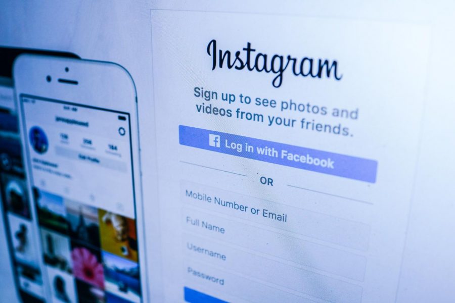
Instagram: A Review
February 26, 2019
Behind Facebook and YouTube, Instagram is the third most successful app in the world. It is so deeply ingrained in the lives of its users that living without it is nearly impossible, but with the all major updates since the layout change, that is becoming less and less true.
Instagram has been known for a long time as a cooler, more open version of Facebook. It lets users discover more people more quickly, is generally well-formatted, and is pretty good for networking. However, it is the little things that cause the problems.
Instagram introduced ads to US users in 2013, allowing brands to randomly show up in people’s feeds. In 2015, Instagram started allowing advertisers to post 30 second videos – twice as long as the average user.
This was the first sign that Instagram was not paying attention to what users wanted, and instead was prioritizing advertisers. Instagram even made a statement backing this.
“…To better appeal to advertisers to give them the flexibility of creating content to market their products,” quoted Ken Yeung, staff writer for Venture Beat.
Soon after this admission, though, they gave everyone that ability.
The next problem came when Instagram replaced chronological feeds with an algorithm that would show users what they interacted with most, which no one asked for. It made it hard for small accounts to get off the ground, and thereby made a lot of people angry. Yet, despite pleas for a revert, Instagram has announced that the change is permanent.
Finally, Instagram keeps changing the interface and it is never for better. Earlier this year, they attempted to introduce a new way to scroll through the feed, in a left/right gallery fashion instead of the usual up and down (see here). Immediately, there was backlash. It was shown immediately that Instagram released an update setting it back within days, with a tweet claiming the update was a bug (see here).
In addition to that interface change, Instagram has updated the profile display, making it bigger, but hardly less detailed and therefore clunky. The only thing removed was the ability to see how many posts are on an account.
Unsurprisingly, there aren’t many supporters of this update either. The redesign is meant to be cleaner and more accessible, except it just isn’t (see here).
Despite all its downfalls, it is still a great app. It lets users explore, share interests, and see as much funny content as users can handle. It is one of the top three most used apps for a reason.
Yes, the updates are awful, but the overall purpose of the app makes up for it. It is great for businesses, it is great for keeping up with whoever, and it is great for keeping users entertained.
So long as it keeps doing that, it shouldn’t go anywhere. Four out of five, would recommend.


